Saturday 11 October 2014

Lovely new dies!!

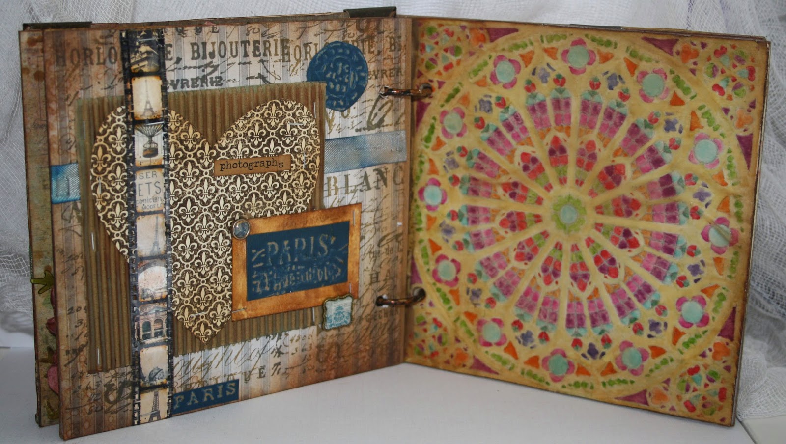
over the past weeks I have seen the new Tim Holtz layered dies popping up all over the place and I have loved all 4 that I have seen. So, flinging restraint to one side, I went out last week and bought all 4 of them.

I decided to use the butterfly, dragonfly and bee ones to make a trio of plaques to put on the dresser in my living room at home. I recently redecorated and the wallpaper that's we put on one wall is from Laura Ashley and it contains shades of blue, pink. Green and yellow, so I thought I would take 3 of those colours as the main colours in the plaques.

I used Tim Holtz foil to cut out the dies and then I thought I would try different techniques on each and see how they came out.


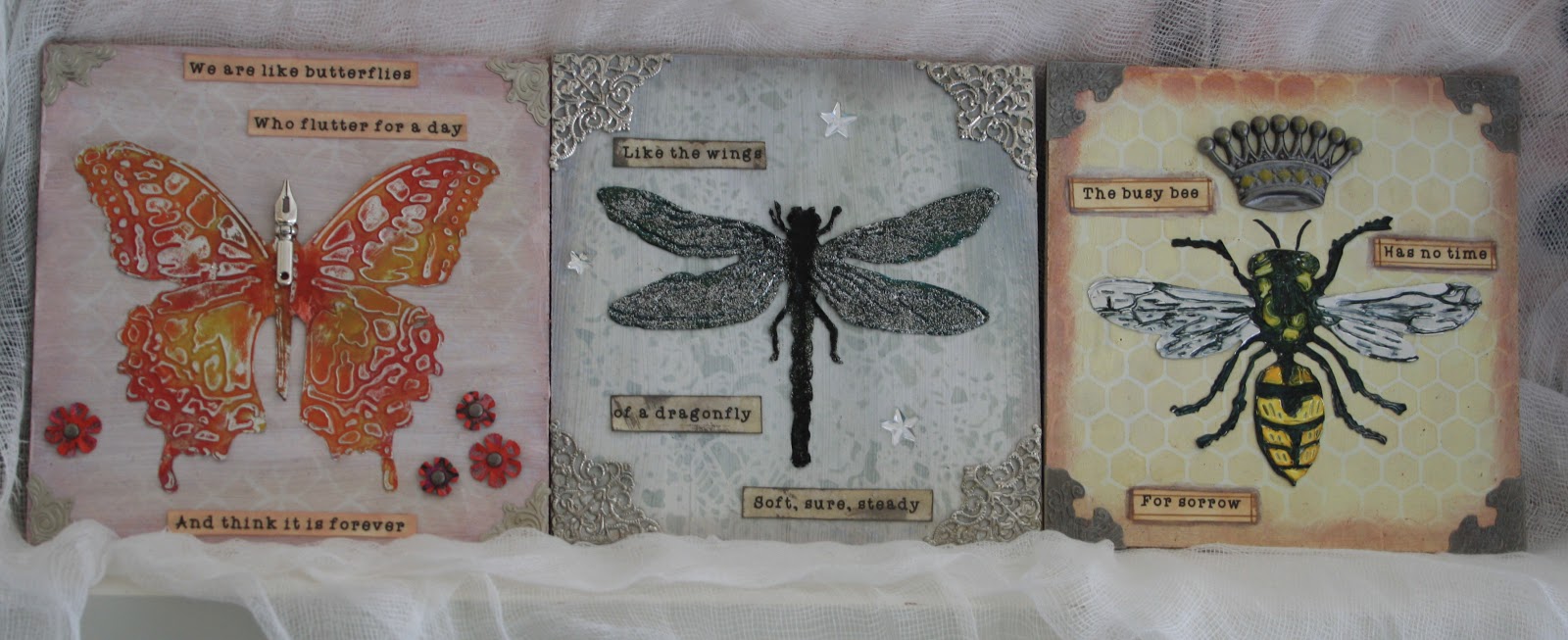
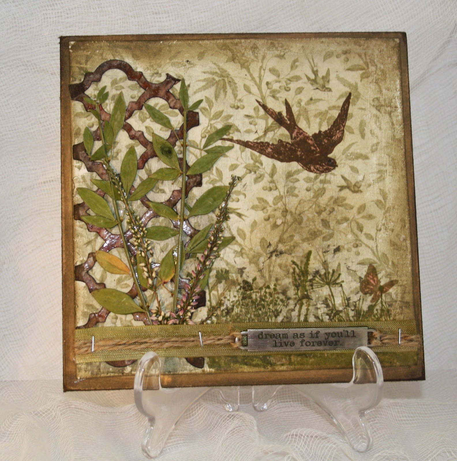
Each of the plaques were 6x6 squares of MDF. I painted each of them with a light cover of gesso and then dried them. For the butterfly plaque I used Victorian Velvet stain, which I watered down and fired so it was patchy. I then used the same colour ink and one of Tim Holtz stencils. I did exactly the same for the dragonfly square, using Iced Spruce stain and ink and finally the bee one was made with seedless mustard.


For the butterfly, I used various shades of distress paint and then, when they were dried, i sanded some of the paint off. I used a pen nib for the butterfly's head and added some painted Tim Holtz foliage. The words were printed out and then coloured with a little ink befor being cut out into steps and adding to the picture.


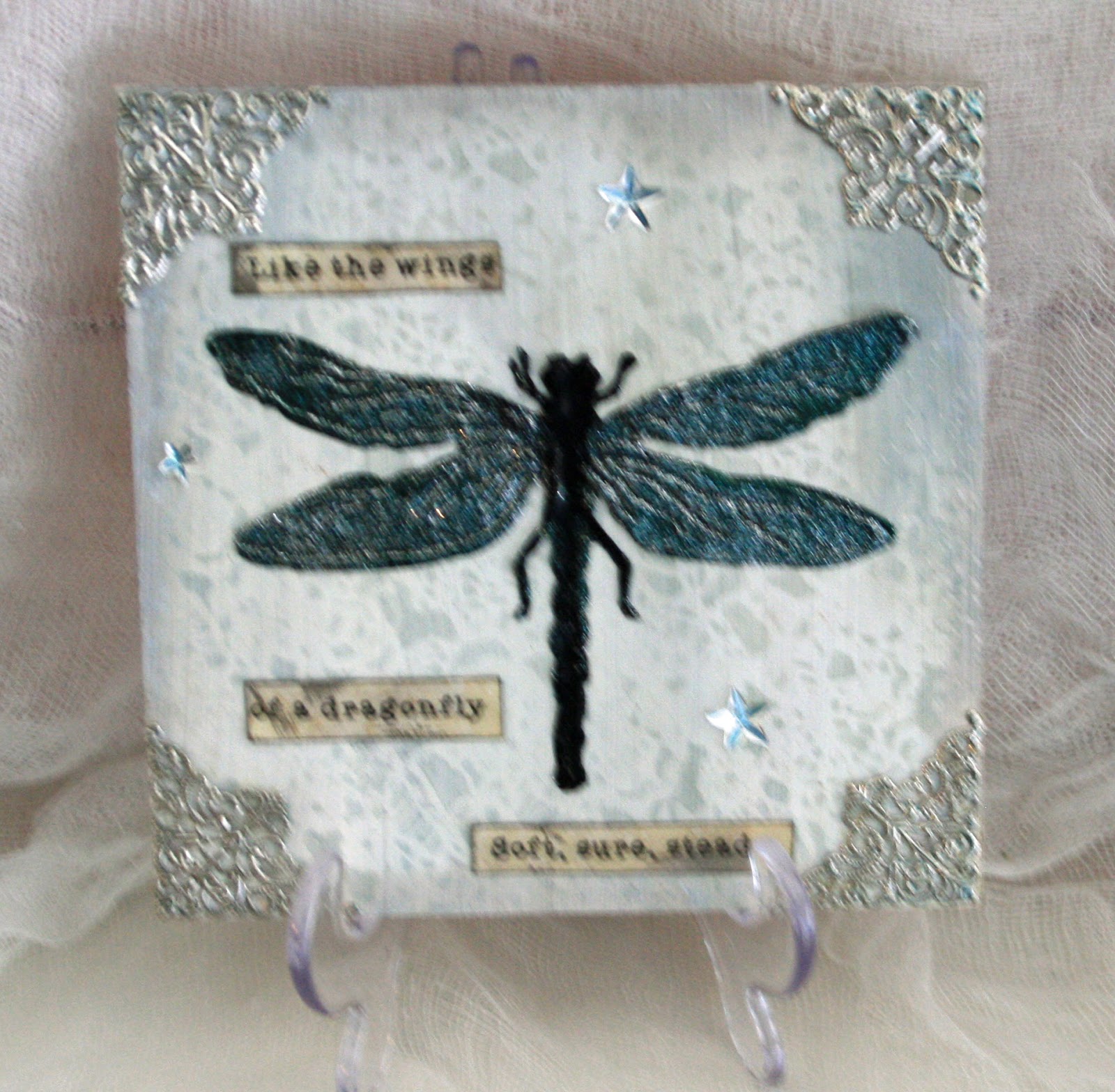
The dragonfly has been embossed in 3 different colours and what doesn't show in the photo is the beautiful iridescence of the wings as it shimmers between black and green. This whole plaque shimmers from the delicate silver corners and the Tim Holtz clear stars


Finally, the bee was coloured using alcohol inks. I love the use of crowns with bees as it always makes me think of France and so I added one of Tin Holtz' crowns to this. I added a little yellow paint to the crown to reflect the yellow of the bee.

I really like each of the 3 and can't make up my mind which I like best. It is just as well that I don't have to decide between them!

I am going to enter this trio of plaques into the following competitions:

A Vintage Journey - Heavy Metal
Fan-tastic Tuesday
Sparkles Monthly Challenge


Friday 10 October 2014

It's Halloween time

I'm not really very big on Halloween, but my children (all grown up) and grandbabies are. So, for the first time ever, I am getting into the Halloween spirit. We have a party arranged and will do we trick and treating.

Here is something I made for part of the decorations.


I don't usually do "scenes", but this one came to me as I sat chatting to my daughters over a cup of tea and I had great fun putting it all together. I wanted to look like a dusty old shed where spells and potions had been mixed and I love the way it came out. It is a 6x6 square of MDF, which I covered with a piece of  paper with a wood panelling pattern. Then I stained the main shelf and small shelf using a Tim Holtz wood stencil. I die cut the raven, bottles and webs and fussy cut the hat and smaller bottles. There is a smattering of rub ons and everything is covered with a sprinkling of Vintage Photo distress embossing powder and Rangers verdigris embossing powder.

I am entering this into the following challenges:

Cut it Up challenge blog

Simply Create Too

Punk you girl

Lunagirl moonbeams

Haunted Design house


Saturday 23 August 2014

ATB photo album case

I love making ATBs, it is probably my favourite crafty thing to do at the moment and so when the Frilly and funkie blog challenge was "Hip to be Square" and involved making an ATB I was really happy.

I wanted to do something that I hadn't tried before, and so I knew that I wouldn't be making "just" an ATB. It took me ages to work out what I was going to do because I wanted to make something that I would actually use. I got into paper-crafting because I wanted to document my family history and so bringing those two things together, I came up with the idea of making mini scrapbook albums and using the ATB to store them in! What I hadn't thought about was how many pages that would involve making, staining, stencilling, stamping and embellishing! All in all, including the front covers there were 80 pages!

I decided to make albums of each of my grandchildren, as they are also my favourite things! The ATB holds 5 albums and, although I have 7 grandchildren, two of them  I only see  a couple of times a year as they live so far away and I don't really have enough photos for an album each, so I decided to make albums for the 5 grandchildren I have lots of photos of and I will make another project for the other two.

The ATB was made from thin cardboard and the inside was covered with paper from Prima's Seashore range. I covered the edges in washi tape and then added Gold Rub n Buff. For the sides, I cut 6 pieces of manilla card, which I covered with pages from an old edition of "A Tale of 2 Cities" (just mentioned that as it is one of my favourite books ever). I covered these with a thin layer of gesso. Once the gesso was dry I used very thin coats of Antique Linen and Broken China Distress paint to cover the sides. After this, I used various colours of archival inks to stamp the background. I decided that as my albums were documenting the details of my grandchildren's lives then it would be appropriate to use die cuts and stamps which were connected to writing etc. - I really love the way the pile of books and quill pen came out,  it is the first time I have used it, but it certainly won't be the last.


Each album was made in the same way. I used my Silhouette Cameo to cut out 5 front covers and 40 double pages for the inside of the albums. I also cut out each of my grandchildren's names.

For the front covers I used Distress Inks in Scattered Straw and Tumbled Glass and then I stamped images connected to each individual child. For example, Caleb has been on a couple of Mediterranean cruises and loves talking about his "big boat", so I decided that would be the focus of his album. I coloured in the names with Gathered Twigs Distress stain and added them to the front of each album.

Each of the insides of the albums is different, but there are some things in common - I used the same stencils for each, the same coloured archival inks and for each child there was one page that had their date of birth. I also added a little paper envelope and a Tim Holtz Journalling Ticket for extra places to add information etc. I haven't added all of the photos yet; just the first photo in each album. I used lots and lots of rub ons in the albums, mostly Tim Holtz ones, but also some from Bo Bunny and various Tim Holtz embellishments. There are also some bits and pieces from Graphic 45's Botanical Tea range.

I didn't think anyone would want to wade through all 80 pages of the albums and so I have just put photos of some of them on here, but all of them are on my Google + if any one wants to take a peek!!


I hope you have enjoyed looking at the pictures. I had a great time making this project and I know I am going to love sitting with my grandchildren choosing which pictures and information to include in them.

I am entering this into several challenges:

Frilly and Funkie Challenge Blog - Hip to be Square. 
Stamping Sensations - Anything goes
Art with Heart Challenge - Anything goes
Vintage Utfordring  (Vintage Challenge) - Make a box
The Artistic Stamper - Anything goes
Sarah Hurley 365 - Favourite things
Inspirational Journal blog


Monday 11 August 2014

Something natural

5 of my grandchildren were around my house this afternoon, now as much as I love them, and I really do, 5 children all aged between 18 months and 5 years can be just a little noisy and so after a couple of hours I escaped to the quiet of my bedroom and my craft space.

Yesterday I saw that the new challenge on Ink on My Fingers was "Natural colours and elements" and today I had an email to say that the new challenge on the Simon Says Stamp Monday Challenge is "Scratched Up". I knew I only had a short time to make something and so I was pretty happy with the project I made.

It was made on 6 inch sq mdf board, which I edged with a couple of coats of different colour distress paints and then I sanded the edges before using Walnut Stain distress ink on them.

The background paper is from Tin Holtz' Wallflower paper and I cut it down so it was smaller than the mdf board. I sanded the edges of the paper too and then added ink to the edges of that.

The framework was cut from patterned paper, inked with different shades of brown and covered with Modge Podge. Once it had dried, I then sanded bits of the frame and added Walnut stain over those parts.

The leaves and flowers are from some dried flowers I had in a flower press. I ran them through my Xyron sticker maker, which worked reasonably successfully, although I had t stick some of the leaves on by hand.

I then stamped the grass and flowers at the bottom of the plaque twice, once in green and then again n brown. I also stamped the bird and butterfly, both of which had some pink distress stain added to echo the pink in the dried flowers. Finally, I added the ribbon, wordband and string.

The frame looks really shiny in the photo, but it doesn't look too shiny in "real life".


Tuesday 5 August 2014

A memory book

Looking through my cupboards the other day I found some Tim Holtz grunge board 6x6 album pages and I decided to make a mini album. However, things didn't work out that way and what I have ended up with is more like a completed scrapbook for a vintage trip to Paris! On one of the pages there is  a photograph of my grandmother and I have imagined that this might have been something she might have made when she was young.

On all of the pages I have used distress stains as this fits in with the current challenge at A Vintage Journey which is being sponsored by County View Crafts . I am also entering this into the challenge at Simply Create Too, which has an old or vintage theme for its current challenge. There are lots of photos here, so apologies for that, but I hope you like them.

Rather than write loads about what I did, I will just explain how I used the distress stains on each page.

Front cover

The background was made by dragging Manila card through scattered straw and antique linen distress stains, which had been put onto my crafting mat and spritzed with water. Once this was dry I stencilled distress stains using the Tim Holtz Gothic and Burlap stencils and another one, which I don't have the name for. I also used stains for colouring the ribbon.

Pages 1 and 2


Page 1


The tag for this page was spritzed with Distress ink and when it was wet I crumpled it up so it became wrinkled. I then uncrumpled and dried it. Once it was dry I lightly sponged more DS over it so that the wrinkles all showed up. The little heart is worn lipstick DS which was covered with Rock Candy crackle and the little label used yet more scattered straw DS, which is my favourite at the moment. I love the dried lavender I have used on this page, which came from a flower press I bought from a charity shop a few years ago and was full of dried flowers and leaves.

Page 2

I stuck some decoupage paper to Manila card using Modge Podge and then I sprayed it with water and added DS to it. I love the effect where some of the paper took up very little stain, but other parts of the page has lots of stain. The background card was laid into distress stain spritzed with water and then I stencilled through a Tim Holtz stencil and one of fleur des lisle that I made myself. The feather was made by diluting stain and using a brush to paint. I really like the effects of these two together.


Pages 3 and 4

Page 3


This is a photo of my paternal Grandmother, Eileen Cooper, nee Smith who I never met as she died 4 years before I was born. However, she and my Dad look so alike that I feel as though I know her. As far as I know she never went to Paris, but as I put this project together it was her I imagined as the person collecting the bits and pieces and making the book (My daughter says I am ever so slightly mad!). On this page I used DS for the flowers and leaves as well as making the age spots on the background and the frame.

Page 4

The brown background for this one was made with various brown DI stains - I believe they included vintage photo and walnut stain. The front image is a Justrite stamp and I used a brush to watercolour the image using faded Jeans DS and a variety of greens. The little label was Vintage photo DS. I love the simplicity of this page, although if you look closely you will see that I stuck the front image on upside down and the background script is therefore upside down. Luckily, the browns are dark and so the mistake is not immediately obvious!!

Pages 5 and 6

Page 5

This was the last page I made and it took me ages to decide what to do, but when I found the little Paris images I knew immediately that I wanted to include a piece of Tim Holtz' photo strip, which I love. I used DS less on this page than any other, but I used it to colour the ribbon and the background of the label. I like the combination of browns and blue and I like the addition of the embossed card stock.

Page 6

One of my own favourite memories of Paris is the magnificent Rose Window in the Notre Dame Cathedral. I loved the way the light poured through the window, lighting up the inside of the building. I was unsure about including this page as it is so different from all of the others as it is so bright, but I tried to age it and tone it down by using Vintage Photo distress ink over the top of the image. The window was coloured in using undiluted stains and a paint brush. It took ages to do and made me remember being a child and doing colouring in!

Pages 7 and 8

Page 7

I used distress stains for the background of this. the colours included Pumice Stone and Victorian Velvet. I then used Victorian Velvet distress ink which I stencilled through the Tim Holtz Harlequin layering stencil and then clear heat embossed it. The tickets were cut from a Tim Holtz die and I added the stamping including the Eiffel Tower stamp. The background of the tickets was also distress stain. The images were from a Prima Pad called Cartographer. 

Page 8

I wanted this page to be a collection of bits and pieces that might have been collected during a trip to Paris. The background is also from the Prima Cartographer pad and I added Vintage Photo and Frayed Burlap stains to it. The man at the  front was cut from a Tin Holtz paper and I coloured him in with very diluted stains, I loved the faded look of it.

Back page

This was completed in the same way as the front cover

I ended up really liking this little book as it is something that I have not done before and I was pleased with the way it turned out.

What I am enjoying about entering challenges is that I am trying out new things and practising things that I have done before. I am very new to all of this and I love learning all of the techniques and I think I am gradually becoming more adventurous in what I do. 

Friday 25 July 2014

A configuration box for my daughter

My younger daughter put in a request for a "sort of steampunky" box for her bedroom in her new home. She wanted something that was a raspberry pink and silver and tael too if I could fit it in.  I had a really good time playing with this. I was so engrossed that I didn't realise that it was almost 3.30 am!

The industrial foil look of the front cover and the edging for the  inside fits perfectly for the Compendium of Curiosities challenge which is to use Tim Holtz' painted industrial technique.

You should take a look at the entries for this challenge, there are some amazing projects on there, some of them are totally mind blowing!


Tuesday 22 July 2014

A wonderful life

My younger daughter has just come out of an abusive marriage and has had great courage at moving on. I am very proud of her. This tag is for her. I always think of orange as a very positive colour and the sentiments both sum up my wishes for her life. The dragonfly, like the butterflies, symbolise something beautiful coming from something ugly.

This will be entered into the Our Creative Corner blog, which has the theme of homemade flowers and home coloured ribbon. I know that the challenge last month was orange, but for the reasons above, I wanted to use the same colour again.


Saturday 5 July 2014

Pompeii

Pompeii may seem like an odd title for a post on stamping, but hopefully all will become clear.

A Vintage Journey have a challenge to create something using all the stamps in a set. I have just bought Tim Holtz' Stampeers Anonymous Classics number 7 and when I saw the challenge I thought it would be a great stamp set to use on an ATB.

I made up the box, covering the joints in Washi tape and gold Rub n Buff and then cut 5 3x3 pieces of manilla cardstock and used Rangers Dandelion archival ink to stamp the images onto the cards. On some of the sides I just used bits of a stamp and on others I used the same stamp more than once to fill the card up.

Once this was done, I added Tea Dye, Mustard Seed and Scattered Straw Distress Stains to my craft mat and spritzed with water. I pulled each card through this and dried with a heat gun.

Now this is where Pompeii comes in to it because there was something about the colour of the cards combined with the stamps that really reminded me of my trip to Pompeii last year. One of the cards looked like the cobblestones in the streets, whilst others, such as the one with a column and the one that ended up looking like wallpaper or wall paintings both reminded me of the remnants of decoration that could still be seen in some of the ruined houses.

For some reason, this made me think of the "Grand Tours" people in the past used to make around Europe and so I started to stamp things that could be related to that idea. Hence the Victorian men, who might have gone on one of the tours. Pens for writing their experiences, the compass to signify the journey and the bike a symbol of travel and transport. I used the verse "The impossible is often the untried" to show how these people were pioneers in travel etc.

This was a perfect challenge for using Tim's products and I am really happy with the way the box turned out.